Composable Layout
←backChallenge
A corporate website requires new content and frequent updates driven by the marketing and content teams. However, existing workflows-content is created by the content team, then passed to the product team for design, and finally to engineering for implementation-is often slow and inefficient.
With small and already stretched design and engineering teams, this handoff-heavy process created bottlenecks. Urgent requests from marketing to publish or update web content only compounded the pressure, leading to delays and frustration across teams.
Goal
Design and implement a flexible system that empowers non-technical users—primarily marketing and content teams—to independently create, assemble, and update web pages. The solution should minimize reliance on design and engineering resources, while maintaining brand consistency and design integrity.
Proposal
As a Design Engineer with a background in both marketing and content development, I was uniquely positioned to take on this challenge. Bridging the needs of three distinct teams—marketing, design, and engineering—required thoughtful consideration and a systems-level approach.
To guide the solution, I focused on a few key questions:
- How can non-technical users in marketing manage content and layout effectively?
- How can we ensure design consistency in layout, typography, and brand?
- How will this system integrate with the existing frontend tech stack?
- How can it remain flexible enough to accommodate evolving content and design needs?
Layout and Display Pattern
Create a system that enables selected content to be seamlessly integrated into a structured, reusable layout framework. This framework prioritizes visual consistency, clear hierarchy, and brand cohesion across all pages—regardless of who builds them.
By separating content from presentation and enforcing design standards at the component level, the system supports flexibility for marketing while maintaining a reliable and polished user experience. It’s adaptable to evolving needs, yet grounded in a scalable, maintainable structure.
The Layout element
The Layout component serves as a flexible container designed to structure and arrange one or more Display elements within a page. Acting as a parent section or row, it manages spacing, alignment, and overall composition, ensuring consistency across different page layouts.
Each Layout instance comes with a set of foundational block-level styles—such as padding, margin, background, and responsive behavior—providing a reliable framework that supports content modularity while preserving design standards. This allows teams to compose pages quickly and confidently, knowing that each section will adhere to a consistent visual rhythm.
The Display element
Display elements are modular, self-contained units of content—such as text blocks, images, videos, or interactive components—that live within a Layout container. Each Display element is designed to be reusable and adaptable, with built-in base styles for typography, spacing, and media handling to ensure visual consistency.
While Display elements manage their own content and visual styling at the component level, their placement, alignment, and overall flow are governed by the parent Layout element. This separation of concerns allows for flexible content creation while preserving structural integrity across the site.

Representation of Layout and Display elements individually and combined into a page layout
Styles
Each Layout and Display element is encapsulated within its own dedicated wrapper, responsible for applying the necessary styles and handling specific behaviors. This modular styling strategy ensures that both Layout and Display components maintain a clear separation of concerns while working seamlessly together.
The Layout wrapper defines structural styles—such as spacing, alignment, and responsive behavior—as well as visual styling like borders, background colors, and section-level formatting. In contrast, each Display wrapper applies content-specific styles, such as typography, image handling, or media formatting, tailored to the type of content it presents.
This approach promotes consistency across the system, while giving developers the flexibility to build adaptable layouts. When a bespoke or more complex design element is needed, it's best practice to create a purpose-built Display component with its own styling and logic.

Both Layout and Display elements are wrapped giving them basic layout styles.
Layout style properties
Layout elements can be thought of as distinct sections that are stacked to form a complete page. These sections serve as the building blocks for the page’s structure, each contributing to the overall flow and hierarchy.

Horizonal padding and borders separate Layout elements on the page
Background color fills the sections from edge to edge creating distinct sections
Width will often be predefined for consistancy but when narrower justify can also be used to align the content
Gap is used to separate the displays within a layout, the number of columns can also be defined, with the default set to 1
Display style properties
Display elements can range from simple content pieces, like a single paragraph or image, to more complex structures such as cards or feature blocks. These elements are designed for flexibility, allowing them to be used in various layout configurations—whether it's a full-width row, a grid of cards, or even more intricate arrangements.
Display styles focus solely on the outer appearance and structure of the element itself—defining aspects such as borders, shadows, or margins. The content within the Display element, however, is styled independently within the component and cannot be overridden by the parent Layout. Instead, it can be extended or customized as needed, maintaining separation of concerns between layout and content styling.
Container queries
Container queries are what make flexible and adaptable layouts possible. Display elements are designed to be versatile, allowing the same piece of content to be used in any Layout configuration—whether it's a full-width row, a grid, or another structure.
By utilizing container queries, each Display element becomes responsible for its own layout and styling. Rather than relying on the size of the browser window, the Display element adjusts based on the size of its immediate container. This allows for more granular control and ensures that the content responds to its specific context within the page, improving flexibility and responsiveness without compromising the layout integrity.
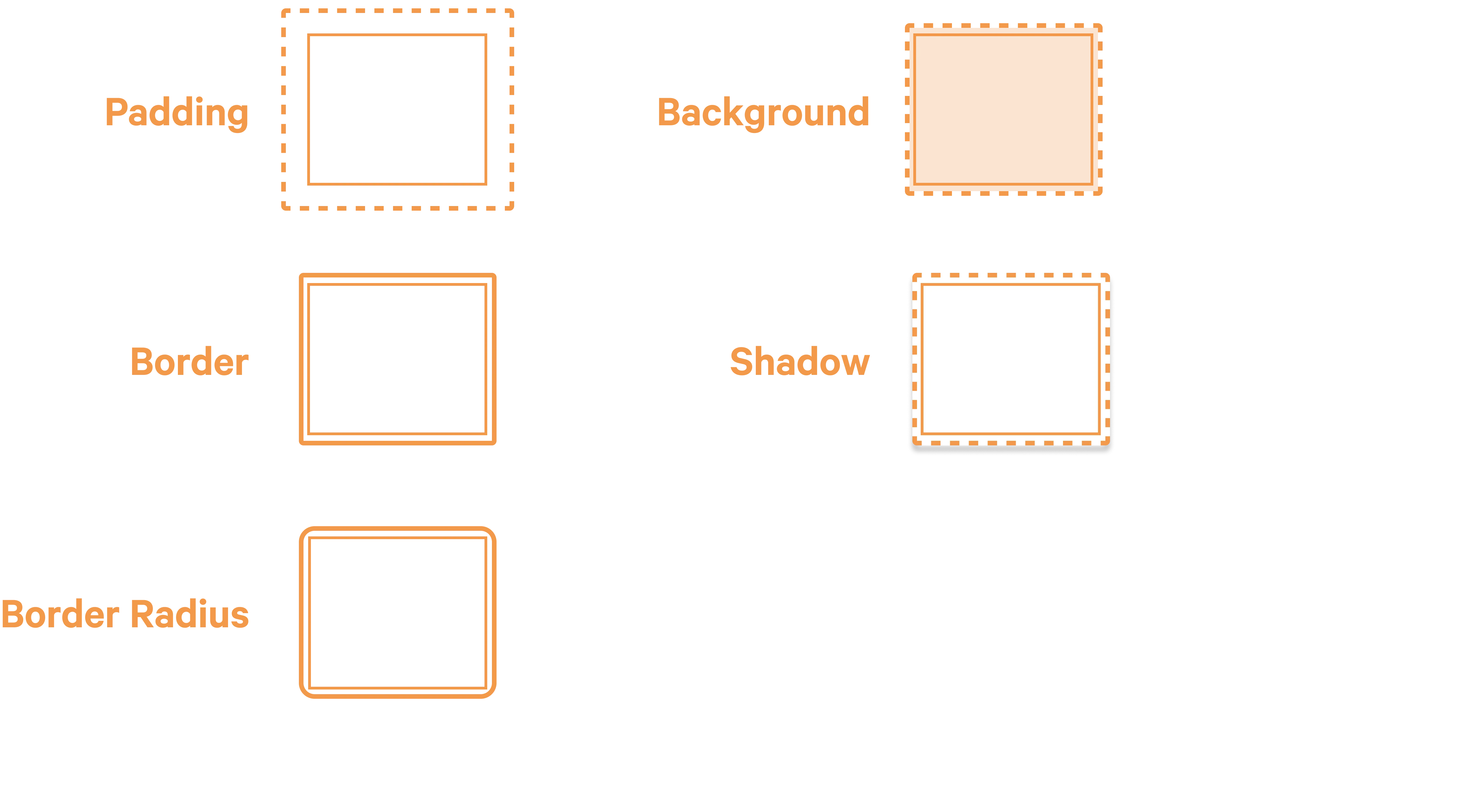
Padding is set uniformly to all sides of the display.
Border and border-radius are also set uniformly to all sides of the display.
Background color fills the display.
Shadow is a boolean property that adds a shadow to the display.
The display wrapper is registered as the container so that the content inside can be styled with container queries.
Up next
- Responsive approach
- Data structure
- Matching Figma components